Customize Universal Login Page Themes
You can create a consistently branded login experience for your users by styling your prompts. With the Universal Login no-code editor, you can easily customize the colors, fonts, borders, and backgrounds of the prompts displayed to users throughout the login flow.
The no-code editor allows you to customize your Universal Login branding theme. To customize the text included in each prompt, review Customize Universal Login Text Elements. For expanded customization capabilities, review Customize Universal Login Page Templates.
To leverage the no-code editor, you must have Universal Login enabled. The Classic Login experience does not support this editor.
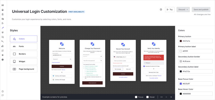
Universal Login no-code editor
To customize your Universal Login theme, follow the steps below:- On the Auth0 Dashboard, navigate to Branding > Universal Login > Customization Options.
- Select a theme component (e.g., Colors) from the Styles menu. Then, customize the options listed to the right.
- After customizing your theme, select Save and Publish.
Theme components
To create your desired Universal Login theme, the Styles menu contains the following components:Color
Color
Select an input field to change the color of the element. To choose specific colors, you can: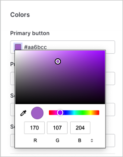
Once you make a change, the preview window displays several examples of the widgets with your specified changes.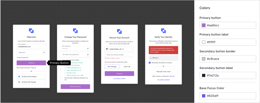
- Use the color picker.
- Input the Hex code or RGB value.
- Select the eyedropper tool to choose a color from your screen for the available elements.
| Element | Description |
|---|---|
| Primary button | Fills primary button, or button that triggers the next action, with color choice. |
| Primary button label | Changes color of text within primary button. |
| Secondary button border | Changes border on input fields. |
| Secondary button label | Changes text within clickable secondary fields. |
| Links and focused components | Changes text color of links that lead users to trigger another workflow, such as reset password or try another authentication method. |
| Base focus color | Changes the color of buttons when the mouse hovers over the button before selection. |
| Base hover color | Changes the color of a button when user clicks on it. |
| Header | Changes the text color of the title in the header. |
| Body text | Changes the text color of body text. |
| Widget background | Changes the background color of widgets. |
| Widget border | Changes the border color of the widgets. |
| Input labels and placeholders | Changes the text of input field labels and placeholder text. |
| Input filled text | Changes text color users type in input fields. For example, username and password fields. |
| Input border | Changes border color of input fields. |
| Input background | Changes background color of input fields. |
| Icons | Changes color of icons inside input fields. |
| Error | Changes color of error messages within widgets. |
| Success | Changes color of success message within widgets. |
Fonts
Fonts
To change the default font, enter the URL to any WOFF (Web Open Font Format) file in the input field. Your WOFF files need to be hosted using a CDN with CORS enabled or a hosting site with Access-Control-Allow-Origin header.Under the font URL panel, adjust the general text size under the Reference text size pixel option. You should note the rest of the options do not change when the reference text is changed.Change the following elements individually: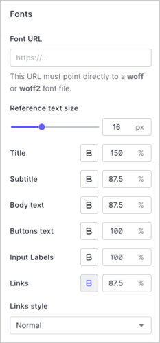
- Title
- Subtitle
- Body Text
- Button Text
- Input Labels
- Links
Borders
Borders
To customize the borders, buttons styles, input fields, and widget corners adjust the slider or choose from the available options.
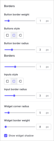
| Option | Description |
|---|---|
| Button border weight | Adjusts width of border around input fields inside login prompts. |
| Buttons style | Changes shape of clickable buttons inside widgets. Available options are: sharp corners, rounded corners, or pill-shaped style. |
| Button border radius | Adjusts corners of clickable buttons when you select rounded corners. |
| Input border weight | Adjusts width of borders of input fields and clickable buttons inside login prompts. |
| Inputs style | Changes shape of input fields inside login prompts. Available options are: sharp corners, rounded corners, or pill-shaped style. |
| Input border radius | Adjusts corners of input fields when you select rounded corners. |
| Widget corner radius | Changes shape of the widget from sharp to rounded corners. |
| Widget border weight | Adjusts width of widget border. |
| Shadow | Checkbox to allow widgets to have a shadow. |
Widget
Widget
Add the URL of your logo to configure the position, height, text alignment, and social login location.
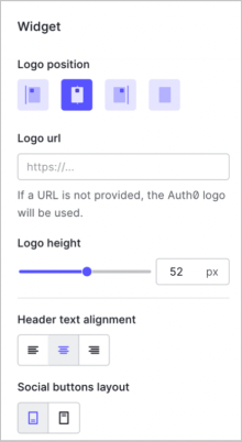
| Element | Description |
|---|---|
| Logo position | Choose the location of the widget to be on the left, right, or center of the page. You can also choose to hide the logo. |
| Logo URL | Enter the URL location of your custom logo. Auth0 recommends SVG files. |
| Logo Height | Adjust the size of your logo at the top of the widget. |
| Header Text Alignment | Choose if text within the header should be left, right, or center justified. |
| Social Buttons Layout | Choose if text should be at the top or bottom of the button. |
Page backgrounds
Page backgrounds
Add a background image URL to choose a background to display in the prompt widget. The No-Code Editor supports other image formats such as PNGs and JPEGs.Then, choose if the widget aligns center, left, or right on the screen.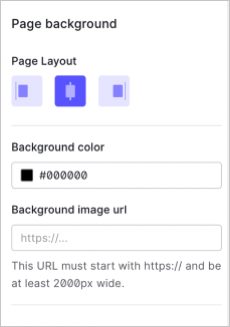
Auth0 recommends you use a JPEG image format at least 2000px wide.